Page 5 of 6
Re: July 2016 Card Sketch - Color on Kraft
Posted: Thu Jul 21, 2016 11:50 am
by Debbie J
Looks good Rachelle
Re: July 2016 Card Sketch - Color on Kraft
Posted: Thu Jul 21, 2016 12:05 pm
by paddlegal
Wow Rachelle these are wonderful! But isn't the background paper Kraft-like? Love your die cuts! How clever of me to send you the perfect ink.

Re: July 2016 Card Sketch - Color on Kraft
Posted: Thu Jul 21, 2016 4:50 pm
by mpizzazz
Very pretty, Rachelle! good substitutes.
Re: July 2016 Card Sketch - Color on Kraft
Posted: Sat Jul 23, 2016 4:33 pm
by pamcook
Here are two quick cards. The Pitt markers show up nicely on Kraft. I just don't have the type stamps that lend themselves to being colored in.
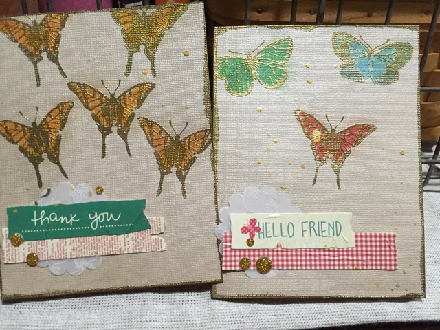
- image.jpeg (145.85 KiB) Viewed 339 times
Re: July 2016 Card Sketch - Color on Kraft
Posted: Sat Jul 23, 2016 4:38 pm
by mpizzazz
They look nice, Pam.
I don't have outline type stamps much either. I got rid of all the cutesy stamps I first bought in the 90s to color. Then I had the CS type that are more detailed to stamp on an interesting background.
Re: July 2016 Card Sketch - Color on Kraft
Posted: Sat Jul 23, 2016 6:35 pm
by paddlegal
Hey Pam these turned out terrific! Using Pitt pens is a great idea. It's been awhile since I tried those pens on Kraft but I remember liking them a lot. Your "clusters" have not gone unnoticed either. Brilliant. Thanks for playing along.
As for the right kind of stamps, if any of you have some of the Unity stamps (like PamP and Debbie might have:) they are great for this challenge.
Re: July 2016 Card Sketch - Color on Kraft
Posted: Sat Jul 23, 2016 6:37 pm
by Debbie J
paddlegal wrote:Hey Pam these turned out terrific! Using Pitt pens is a great idea. It's been awhile since I tried those pens on Kraft but I remember liking them a lot. Your "clusters" have not gone unnoticed either. Brilliant. Thanks for playing along.
Re: July 2016 Card Sketch - Color on Kraft
Posted: Sun Jul 24, 2016 11:35 am
by Keitha
I know this is a card thread but I wanted to play along and decided to try a colour medium no one else has posted here, so pulled out my pigment powders. I used a Hero Arts stamp and fussy-cut the flowers which will likely end up in my art journal; I tucked a small piece of each substrate with each to show what I started with.
#1 was made using the TH specialty kraft paper. I used tangerine and fuschia Color Burst powders and spritzed water over top. This is a coated paper so of course acted as a resist, duh; I ended up with a light colour wash overall. I mopped up the excess water with a paper towel roll and used a heat gun. I found because the paper has some tooth it grabbed the embossing powder all over, adding a bit of a sheen even in the unstamped areas. Not what I was going for, but good to know.
#2 uses a real kraft cardstock with a hard surface, as opposed to a regular cardstock like Bazzill or AC in a kraft colour. Not sure all these years later what brand it is. Here I put lemon and orange Brusho powders on the dry paper and then spritzed with water, and dried with a heat gun.
#3 uses the other side of the same kraft cardstock; for some reason this side is darker and I'm not sure if that was intentional or if it's just aged. Because my surface was darker I used Color Burse Fuschia and Brusho Orange powders which I sprinkled onto wet cardstock. I did spritz more water on top to blend the colours better, and let it mostly air-dry before helping with the heat gun.
I used Ranger Princess Gold embossing power for all 3; it's one of their Ancient Golds line. It looks quite different on the TH specialty paper than it does on the kraft cardstock. Farley, I'd be curious to know what gold embossing powder you used.
Re: July 2016 Card Sketch - Color on Kraft
Posted: Sun Jul 24, 2016 12:59 pm
by paddlegal
Keitha I'm further up the Royalty chain...I used Ranger
Queen's Gold Royal Satin Embossing Powder.
It's been my go to gold for about a year now.
Love your flowers! Using the dry pigments was a great idea. I think #3 is my favorite. Very rich depth of color. Funny...I have a poinsettia that I embossed and colored (now I must remember with what) to use for both the July holiday card challenge and the Kraft. Guess I better do something with it and post it before July is over.
Thank you for your study in pigment contribution.
Re: July 2016 Card Sketch - Color on Kraft
Posted: Sun Jul 24, 2016 1:29 pm
by Keitha
All Hail the Queen! It would appear Ranger has discontinued this line of products; you can still find Princess Gold as one of their specialty powders, but I don't see Queen's Gold

Too bad; I'd have tried it.
Re: July 2016 Card Sketch - Color on Kraft
Posted: Sun Jul 24, 2016 3:43 pm
by mpizzazz
Here are my experiments.
1.The 2 gold ones have the Versamark swiped over the raised design and Pearl Ex powder applied with a brush. The flowered one is embossed with gold glitter powder and colored in with glitter gel pens.
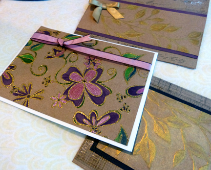
- P1200224.JPG (191.84 KiB) Viewed 320 times
2.Kraft base embossed with black glitter powder and more glitter pens. It is really sparkly. Copper card is embossed in copper powder and colored with pencils and then Goosebumps clear stuff brushed over the flowers.The circles are the kraft paper just shiny.
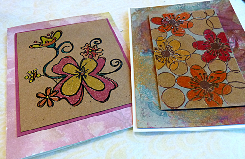
- P1200222.JPG (225.4 KiB) Viewed 320 times
3.Kraft base embossed with copper powder, colored in with Lumiere paints and flooded over the whole thing with the Goosebumps clear finish. The background is the naked kraft paper this time.
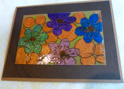
- P1200225.JPG (169.43 KiB) Viewed 320 times
All my kraft paper was cut from the covers of the Tim embossed kraft paper tablet. Used the outside for the 2 card bases and the wrong side for all the panels.
Re: July 2016 Card Sketch - Color on Kraft
Posted: Sun Jul 24, 2016 5:08 pm
by pamcook
Nice artwork Keitha and Marianne.
This has been a great learning experience for me. I never would have thought to color on Kraft.
Re: July 2016 Card Sketch - Color on Kraft
Posted: Sun Jul 24, 2016 7:22 pm
by paddlegal
Wow Marianne, I am just dazzled by your clever and colorful cards. So many cool ways you colored the Kraft successfully. That Goosebump stuff makes a beautiful enamel finish.
Marianne thanks for your inspiring art.
Re: July 2016 Card Sketch - Color on Kraft
Posted: Sun Jul 24, 2016 9:26 pm
by nancine
So many great ideas coming from this thread! Who knew lowly Kraft could be so wonderfully?
Re: July 2016 Card Sketch - Color on Kraft
Posted: Sun Jul 24, 2016 10:21 pm
by paddlegal
Two cards: first the holiday cross post using the challenge for the July holiday card. The poinsettia was first colored with Copics then I applied Wink of Stella for some glitter. It just doesn't show up here. Second card I used this Julie Ebersole's Bold Bloom stamp set, white heat embossed and then colored with a combination of Inktense and Stabillo water color pencils. I'm hard pressed to say which pencils I like best. But both blended nicely mixing colors by using a water brush.